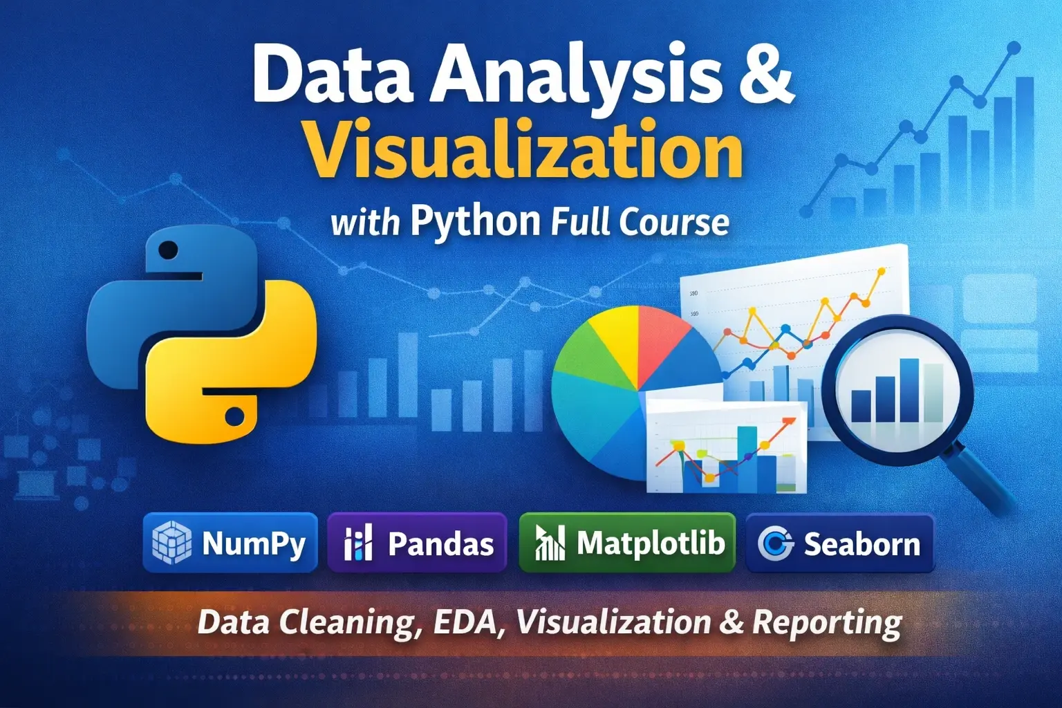
Data Analysis & Visualization with Python
Data Analysis & Visualization with Python is a practical, job-oriented course for learners who already know Python fundamentals and want to apply Python to real-world data analysis. You will learn how to clean messy data, explore patterns, create professional charts, build interactive reports, and turn raw datasets into useful business insights using the most important Python data tools.
Recommended Prerequisite: Python Essentials (Beginner to Intermediate)
Why Take This Course?
- Learn practical data analysis skills used in real analyst workflows
- Work with the most important Python data tools: NumPy, Pandas, Matplotlib, Seaborn, and Plotly
- Build clean notebooks, reusable analysis workflows, and stakeholder-ready reports
- Strengthen analytical thinking, not just coding syntax
- Create both static visualizations and interactive HTML reports
Who This Course Is For
- Learners who already know Python basics and want to move into data analysis
- Excel users transitioning into Python-based analytics
- Beginner to junior data analysts
- Business analysts who want practical data skills
- Anyone who wants to clean, analyze, and visualize data professionally with Python
What You Will Learn
- How to structure real-world data analysis projects
- How to clean, transform, and validate messy datasets
- How to explore data with purpose and think like an analyst
- How to build clear, professional static charts and interactive reports
- How to analyze time series, segments, funnels, cohorts, and customer behavior
- How to optimize slow notebooks and work more efficiently with larger datasets
- How to communicate insights clearly through reports and stakeholder-friendly summaries
Tools You Will Use
NumPy, Pandas, Matplotlib, Seaborn, Plotly, Jupyter Notebook, and VS Code.
Course Outline
Setup, Workflow & Data Mindset
Learn the tools, workflow, and habits used in real analytics work. This module introduces Jupyter and VS Code setup, project organization, reproducible notebooks, analytical thinking, and the full analysis process from asking questions to presenting findings.
- 0.1 Course tools (VS Code / Jupyter) and environment setup
- 0.2 Project folder structure + reproducible notebooks
- 0.3 Data analysis workflow: ask → prepare → explore → explain
- 0.4 Thinking like an analyst: questions, metrics, grain, assumptions, and decision-making
- 0.5 Datasets + how to document assumptions
- Lab: Setup a starter analytics repo + notebook template
1) NumPy for Data Work
Build a strong foundation for numerical data processing with NumPy. You will learn how arrays work, how to perform fast calculations, and why vectorized operations are much faster than plain Python loops.
- 1.1 Arrays, shapes, dtypes
- 1.2 Indexing, slicing, boolean masks
- 1.3 Aggregations and axis logic
- 1.4 Broadcasting and vectorization
- 1.5 Missing values + numeric stability
- 1.6 Performance basics (why NumPy is fast)
- Lab: Clean + summarize sensor readings (vectorized)
2) Pandas Foundations (Core Skills)
Master the most important library for data analysis in Python. This module covers importing data, selecting and filtering rows, cleaning columns, handling missing values, and building summary tables.
- 2.1 Series vs DataFrame + essential operations
- 2.2 Importing data: CSV, Excel, JSON
- 2.3 Selecting: loc/iloc, filters, query
- 2.4 Sorting, renaming, dtype conversion
- 2.5 Missing values (fill/drop) + duplicates
- 2.6 Creating features (new columns)
- 2.7 GroupBy basics (one of the most used skills)
- Lab: Clean a messy sales CSV + build summary table
3) Data Cleaning & Wrangling (Real-World)
Learn how to work with messy, real-world datasets. This module focuses on text cleanup, date parsing, reshaping, combining multiple tables, and simple data quality checks.
- 3.1 Cleaning text columns (strip, replace, regex)
- 3.2 Date/time parsing + time features
- 3.3 Outliers + sanity checks
- 3.4 Reshaping: melt vs pivot
- 3.5 Combining data: merge/join/concat
- 3.6 Data validation checks (simple data QA)
- Mini Project: Merge customers + orders + data quality report
4) Exploratory Data Analysis (EDA & Analytical Thinking)
Discover how to inspect a dataset properly before building reports or dashboards. This module teaches students how to explore data with purpose, ask better analytical questions, find evidence, and avoid common interpretation mistakes.
- 4.1 EDA checklist (what to inspect every time)
- 4.2 Question-driven EDA: what changed, what stands out, and what needs explanation
- 4.3 Descriptive stats that matter
- 4.4 Distributions + skewness + transformations (basic)
- 4.5 Correlation (and what it does not mean)
- 4.6 Segment analysis (groupby + pivot)
- 4.7 Outlier exploration & anomaly flags (simple)
- 4.8 Data ethics & common analytical mistakes
- Mini Project: EDA write-up (insights + evidence + recommendations)
5) Visualization Fundamentals (Matplotlib)
Learn the fundamentals of data visualization with Matplotlib. This module teaches chart selection, the figure/axes model, and how to make charts clear, readable, and presentation-ready.
- 5.1 Chart selection: which chart for which question
- 5.2 Matplotlib mental model (figure/axes)
- 5.3 Line, bar, histogram, scatter, boxplot
- 5.4 Labels, ticks, legends, annotations (make it readable)
- 5.5 Multiple charts + layout
- 5.6 Saving charts for reports
- Lab: Build a clean KPI chart pack (6–8 charts)
6) Statistical Visualization (Seaborn)
Take your charts to the next level with Seaborn. You will create more polished statistical plots, compare categories more effectively, and visualize relationships and correlations with less code.
- 6.1 Themes + style for consistent visuals
- 6.2 Categorical plots: countplot, barplot, boxplot, violin
- 6.3 Relationship plots: scatter, regplot, pairplot
- 6.4 Heatmaps + correlation visuals
- 6.5 Faceting and small multiples (catplot)
- 6.6 Avoiding misleading visuals (common traps)
- Mini Project: EDA Visual Pack (publication-style)
7) Interactive Reporting with Plotly
Create interactive charts and shareable HTML reports that users can explore on their own. This module introduces Plotly Express, hover interactions, facets, time-based visuals, and HTML export for sharing.
- 7.1 Plotly Express fundamentals
- 7.2 Tooltips, hover, interactive legends
- 7.3 Facets, animation, time series interactivity
- 7.4 Exporting HTML for sharing
- 7.5 Build an interactive one-file report for sharing
- Mini Project: Interactive sales insights report (HTML)
8) Time Series Analytics (Very Practical)
Work with date-based data such as daily sales, weekly tickets, and monthly operations reports. You will learn how to sort time series data, resample it, smooth trends, and flag anomalies.
- 8.1 Datetime index + sorting
- 8.2 Resampling (daily/weekly/monthly)
- 8.3 Rolling windows (moving average, rolling sum)
- 8.4 Seasonality intuition + comparisons
- 8.5 Simple anomaly detection (rules + rolling stats)
- Mini Project: Weekly operations report with anomaly flags
9) Business Analytics Patterns
Learn some of the most practical analysis patterns used in product, marketing, and business reporting. This module focuses on KPIs, funnels, cohorts, customer segmentation, and Pareto analysis.
- 9.1 KPI design: north-star + supporting metrics
- 9.2 Funnels (conversion rate & drop-off)
- 9.3 Cohorts (retention basics)
- 9.4 RFM segmentation (simple but powerful)
- 9.5 Pareto analysis (80/20)
- Mini Project: Product analytics: funnel + cohort summary
10) Working with Large Data & Performance
Learn how to make your notebooks faster and more efficient when datasets grow. This module focuses on memory optimization, avoiding slow patterns, chunked processing, and simple profiling.
- 10.1 Memory optimization (dtypes, category, downcasting)
- 10.2 Faster pandas patterns (avoid slow apply)
- 10.3 Chunked reading for big CSVs
- 10.4 Profiling basics (timeit, simple profiling)
- 10.5 Caching and reusing computations
- Lab: Optimize a slow notebook into a fast one
11) Reporting, Storytelling & Delivery
Turn analysis into something useful for real stakeholders. This final module teaches how to write conclusions, organize notebooks like reports, export outputs, and communicate insights clearly.
- 11.1 Writing conclusions (insight → impact → action)
- 11.2 Notebook as a report (structure + visuals)
- 11.3 Export: CSV outputs + chart folders + HTML report
- 11.4 Reusable templates (analysis starter kit)
- 11.5 Presenting results: what stakeholders care about
- Mini Project: Client-ready report (clean notebook + charts + summary)
What You Will Build
- Cleaned and validated real-world datasets
- Structured exploratory analysis notebooks
- Professional static chart packs
- Interactive HTML data reports
- Time series analysis workflows
- Business KPI, funnel, cohort, and segmentation summaries
- Stakeholder-ready reports with clear insights and actions
Why This Course Stands Out
- It teaches both technical skills and analytical thinking
- It includes real-world cleaning, exploration, and reporting workflows
- It adds practical data ethics and common analytical mistake awareness
- It focuses on business-relevant analysis patterns, not just syntax
- It helps learners move from Python basics into real data work
Start Learning Data Analysis with Python
If you already know Python fundamentals and want to turn that knowledge into practical data analysis skills, this course is your next step. Start with the first module, follow each lesson in order, and build a strong foundation in data analysis, visualization, and reporting with Python.

Leave a comment
Your email address will not be published. Required fields are marked *